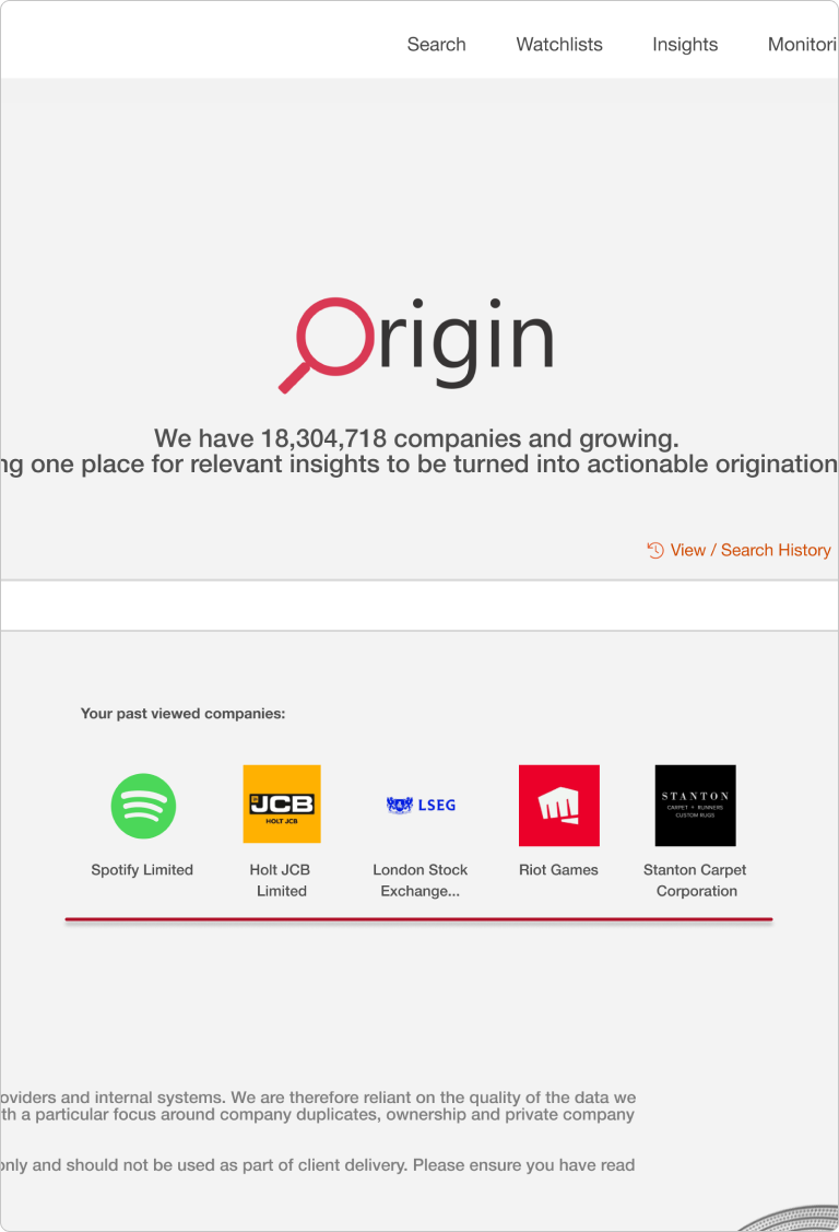
Project Origin
The One Stop Shop For All Things Company Data.
The Background
Origin is a central platform built by PwC, designed to streamline and enhance the origination process. By consolidating data from both PwC and third-party sources, it allows users to gather and analyse key market and company information efficiently. The platform plays a critical role in helping teams identify and assess potential business opportunities, build market understanding, and make informed decisions in Deals.
The Goals
While Origin is a large platform with numerous features, this case study focuses specifically on Version 2 of the Search and Advanced Search. We’ll explore how we improved its usability and increased usage through extensive testing and iteration of previous designs.
Reduce Search Time Increase Usage Of Advanced Search Filters Improve User Satisfaction Scores Visual UpgradesThe Problem
As the Origin platform continued to grow, it became evident that while the V1 search functionality was robust, it didn’t fully meet user needs in terms of speed, usability, and discoverability of advanced features. Many users struggled with:
- Limited Flexibility and Scalability: The original search system was rigid and lacked scalability, making it difficult to add new filters or search criteria as user needs evolved. As the platform expanded, the search functionality became outdated and required extensive redesigns to accommodate additional features. This lack of flexibility limited the platform’s ability to grow in line with user expectations.
- Poor Accessibility of Advanced Search Options: Advanced search features were buried within menus and required multiple steps to apply filters, making it cumbersome for users to customise their searches. This complex structure discouraged users from fully utilising the advanced features, and the inability to view all filters at once led to repetitive adjustments and frustration. Furthermore, users had to restart their search if they wanted to make modifications, reducing efficiency.
- Lack of Quick Access to Recent Searches: The previous system lacked a quick-access feature for recently viewed pages or prior searches, forcing users to re-enter search parameters each time they returned to the platform. This inefficiency was especially inconvenient for users who frequently revisited the same data, interrupting their workflow and prolonging repetitive tasks.
- Confusing Filter Indicators and Usage: Filters in the old design did not clearly indicate when they were active, leading to confusion about which filters had been applied and sometimes resulting in unintended search outcomes. Additionally, there was no guidance or tooltips to help users understand each filter’s function, resulting in underuse of the filtering options.
- Cluttered and Irrelevant Information in Search Results: The company search results were displayed in a poorly organised card layout that presented users with unnecessary information, making it harder to find relevant details. Key data points were buried among less useful content, which prevented users from quickly identifying what was important.
These issues became more pronounced as the platform’s user base expanded, and it became clear that improving the discoverability and usability of advanced search features was essential to streamline workflows and fully realise the platform’s potential.
Origin Search V1 User Journey
The diagram below illustrates the original user journey when interacting with the search feature. This flow highlights the steps users had to take, from navigating to advanced search options to sifting through cluttered results. The process was often cumbersome, with multiple layers of menus, excessive scrolling, and limited visibility of key features, leading to an inefficient and sometimes frustrating experience.
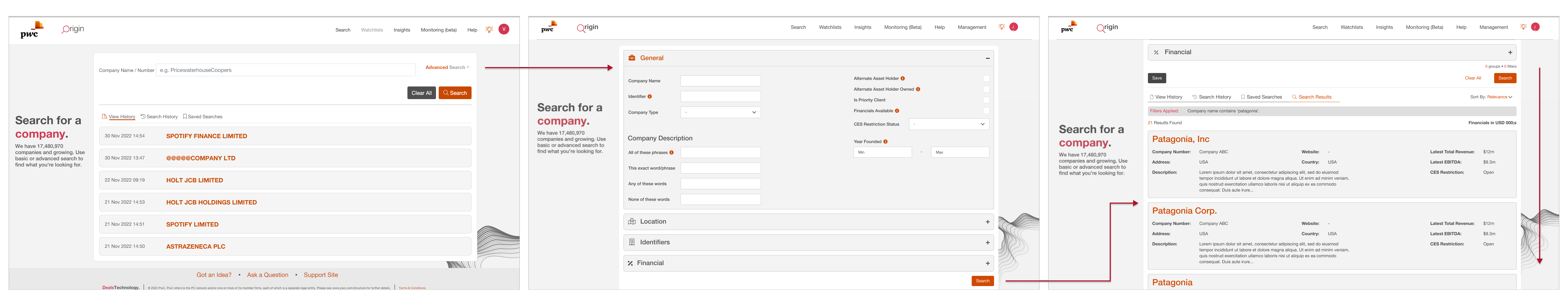
The search function served as the homepage for Origin. To conduct a filter-based search, users must click the Advanced Search button located in the top right corner.
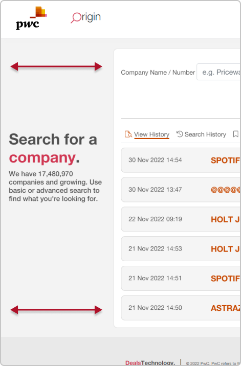
Origin Search V1 Key Issues
Below are some example screenshots of Origin Search V1. I have annotated the images to show you some of the issues that I found after conducting user research and testing.
Optimisation of Space
Excessive padding in this section limits visibility, showing only 5-6 items at a time. By reducing the unnecessary padding and optimizing the layout, we increased the number of visible items to 9, resulting in a 12% improvement in data visibility and a more efficient user experience.
Improving Filter Usability
Filters were poorly organised, causing users to scroll up and down repeatedly in search of specific sections. User testing revealed confusion and frustration with the current layout. This led to a redesign, grouping filters more logically and reducing the need for excessive scrolling.
Visibility of Advanced Features
Advanced search options were hidden and underutilised, as they
weren’t easily accessible. The first step in the redesign was to
group filters together and provide clearer signposts for
advanced search options.
Usability testing revealed that many users were unaware these
features existed, leading to underuse.
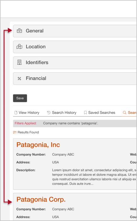
Search Result Navigation
After running a search, users were forced to scroll back to the top of the page to view their results. This issue was resolved by ensuring the results were displayed directly after submission, reducing unnecessary scrolling and improving overall navigation.
The Redesign Approach
To address these challenges, our redesign focused on simplifying the search process while surfacing the advanced search features that would unlock more value for users.
-
Enhancing Search Efficiency Through Redesign
We revamped the search interface to ensure that advanced filtering options were more intuitive and accessible. Instead of burying advanced search features in multiple menus, we surfaced these tools in a simplified, user-friendly interface. This allowed users to:- Filter by multiple data points (e.g., reviewer, sector, location) simultaneously.
- Apply data source filters upfront, ensuring that users were only searching the sources they had access to.
-
Customizable Search Templates
We introduced customizable search templates, allowing users to save their frequently used search parameters. This further increased their flexibility and made it easier for users to perform complex searches with a few clicks. -
Data Source Integrity
The team worked with security roles more easily, we added in extra source visibility indicators. Users could now see what systems they had access to before running a search, improving the accuracy and comprehensiveness of the search results.
-
Search Results Presentation
We enhanced how search results were displayed to provide a cleaner, more organized view. Key data points were highlighted, and users could dive deeper into specific sections while staying aligned in the overall search. This allowed users to quickly identify the most relevant information for their needs.
Origin Search V2 User Journey
The diagram below showcases the streamlined user journey in Version 2, with advanced search options consolidated into a single, organised interface. Key features are clearly visible, reducing scrolling and enabling easy filter adjustments. Enhanced search cards highlight relevant information, making the experience more intuitive and efficient.
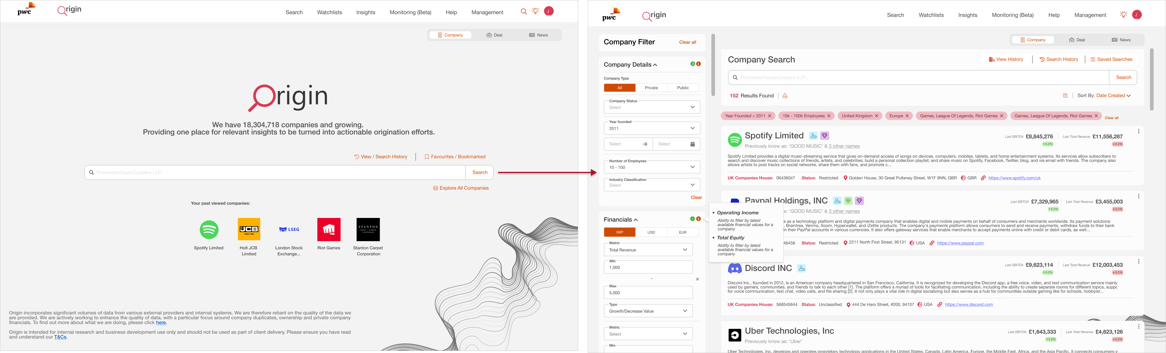
Previously, the platform lacked a dedicated home page, dropping users straight into the company search, leaving them unsure where to start. Now, users land on a welcoming home page where they can easily resume recent searches, explore recommended companies, or dive into the full database of 18 million companies.
But What's New?
Below are some of the newly added features along with the design rationale behind each one.
Adaptable Search for Future Growth
As the platform continues to expand, the search feature has been designed to be flexible and future-proof. The final design allows for new filters to be added easily, ensuring the system remains adaptable even as new features and criteria are introduced. This ensures the platform can evolve without needing significant redesigns.
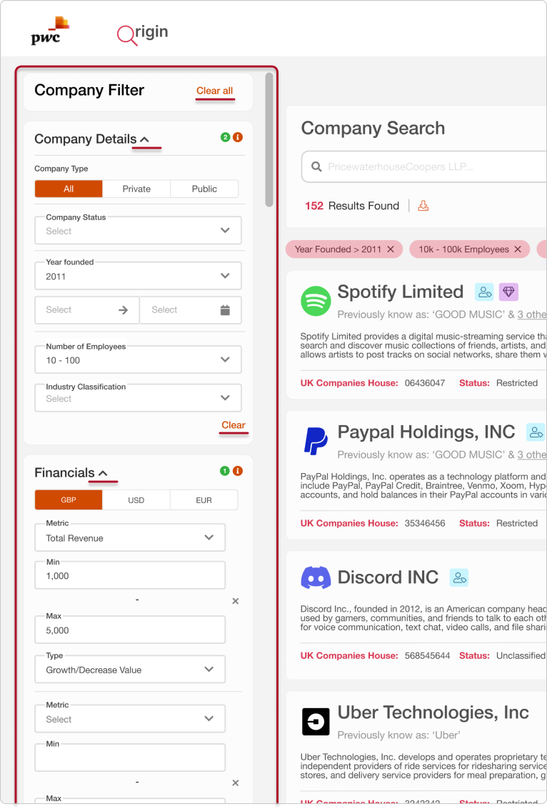
Enhanced Advanced Search
Previously hidden in a menu, the advanced search feature has been redesigned for better accessibility. Users can now apply multiple filters on a single screen, seeing everything at a glance. This eliminates the need to apply filters in separate steps, allowing for quick edits without starting a search from scratch.
Users can also collapse sections they don't use and their choices will persist in the future
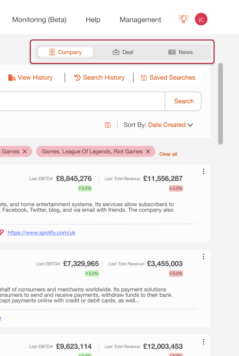
Faster Quick Access Features
A recent page views feature was introduced to skip the search feature if possible. This addressed the need for users to easily revisit their searches without researching.
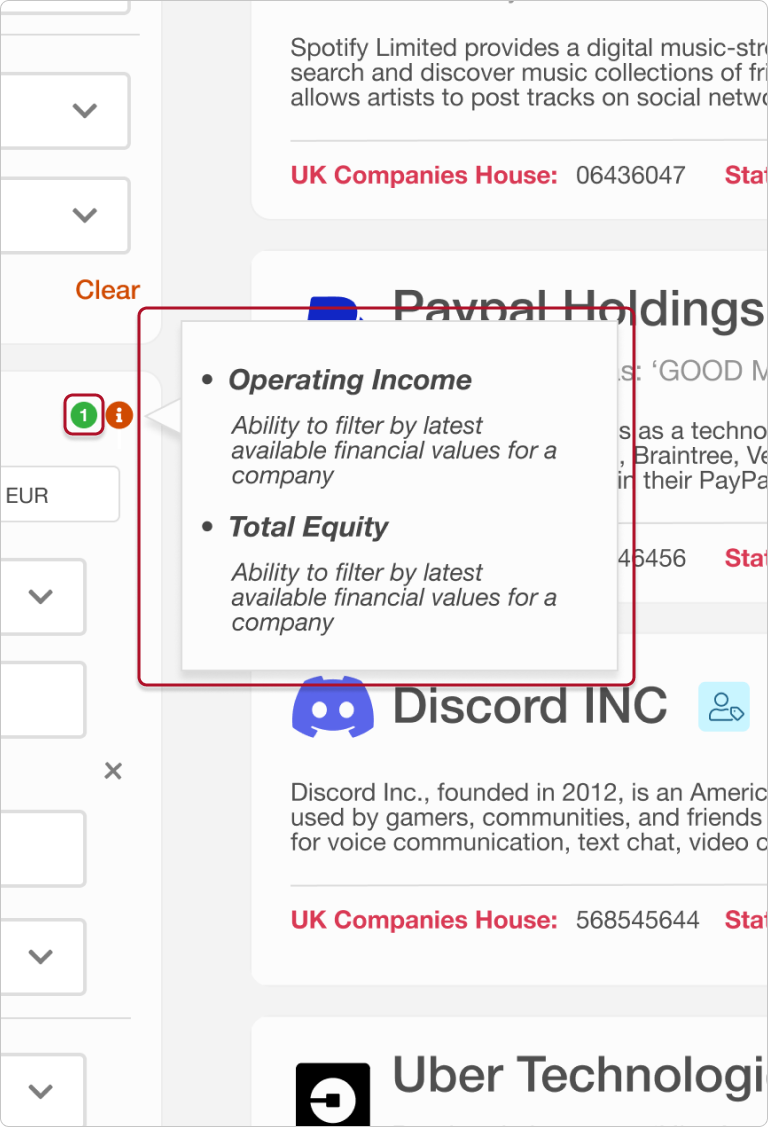
Filter Indicators and Information
Each filter section now has enhanced visibility. Indicators were added to make it immediately clear when filters are active, addressing user confusion about which filters had been applied at a glance
Also a tool tip has been included inside of each filter section empowering the user supporting them in utilising the filters to their full potential
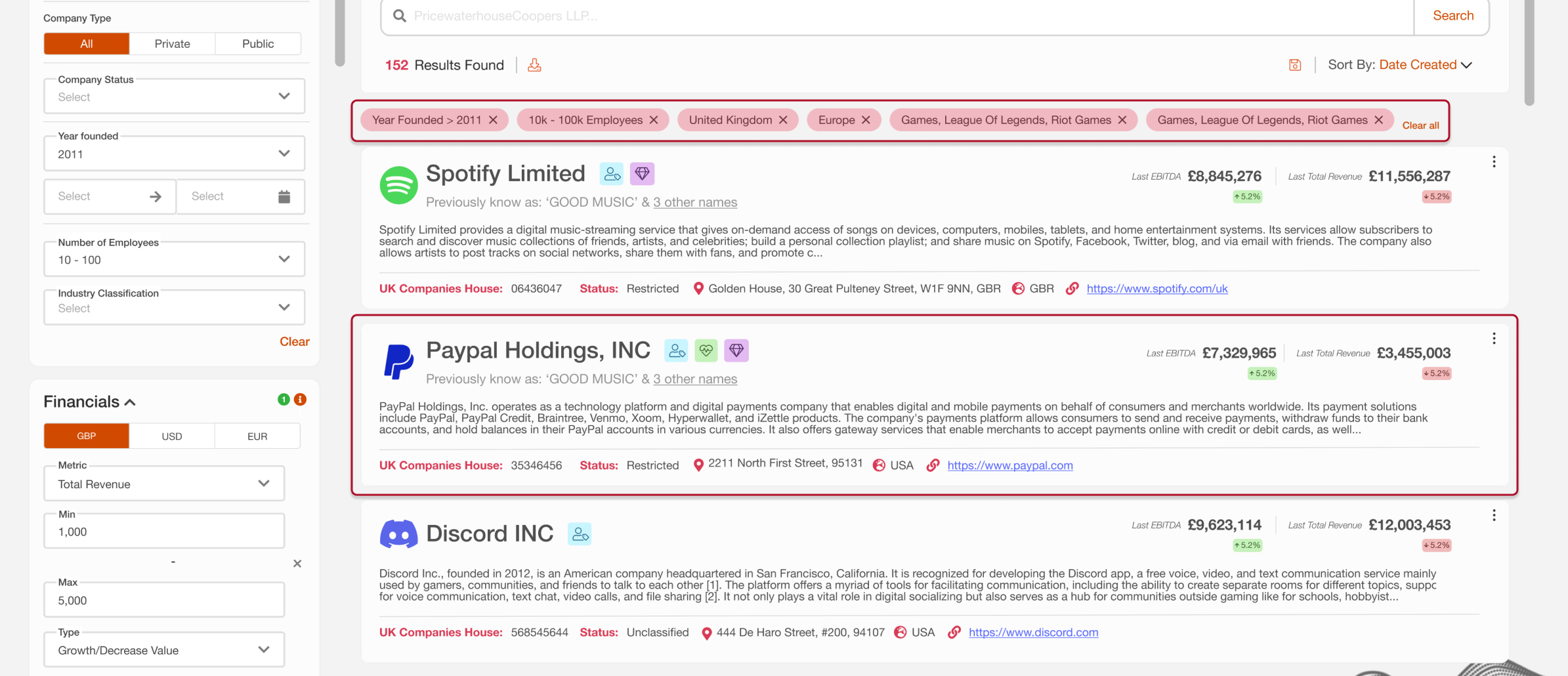
Enhanced Company Cards
The team agreed on a card layout that presents users with the maximum amount of data in a clear, digestible structure. The cards are divided into expandable sections, allowing users to view more details as needed. The company name is prominently displayed for easy identification.
The Impact
The redesigned search feature significantly reduced the time spent on research tasks, increased the use of advanced search options, and improved the overall user experience. As a result:
Search time was reduced by an average of 30%, allowing users to focus more on analysis and decision-making rather than manual data gathering.
User satisfaction scores for search functionality rose by 25%, reflecting the improved ease of use and efficiency.
Usage of advanced search filters increased by 40%, demonstrating that users were now better able to unlock the full potential of Origin's capabilities.
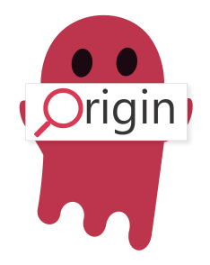
Fun Additions
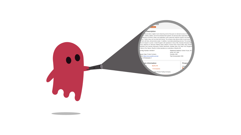
Alongside the serious design work, we got a little extra creative! We decided to bring in a product mascot to inject a bit of personality and playfulness into the system. Meet the red ghost – that adds a touch of fun to otherwise functional pages. Below are some examples of how Ori the Origin ghost was incorporated to make the user experience a little more entertaining.
Market Me!
Our very first use of Ori wasn’t just for fun – it became a cornerstone of our marketing and alerts system. Ori quickly evolved into a recognisable face of Origin, popping up in campaigns, notifications, and even as an alert mascot to highlight important updates. Whether he’s waving to announce a new feature or giving a friendly nudge when there’s a new message to read, Ori became a subtle but engaging way to grab user attention. He proved that even serious systems can benefit from a little character and charm!
The 404 Ghost
Here’s an example from the 404 page. Ori is popping up when users stumble onto a missing page. Rather than frustrating, Ori turns the experience into a bit of lighthearted fun, quietly poking around for the missing content. He serves as a friendly reminder that even errors can be fun with the right design!

The Guessing Game
Now, for a bit of mystery! I’ll give you a hint about the next Ori illustration – it's a clever play on words. Can you guess what page this ghost might be used for? Take a guess and click the button below for the answer.

Halloween Ori
And of course, we couldn’t resist giving Ori a little seasonal flair. Who doesn’t love Halloween? In this festive edition, Ori gains a witch’s hat, accompanied by pumpkins. He even holds a little sign with a message – just another way we made the platform fun and engaging, while still keeping things functional.
Thanks For Reading!
Why don’t you check out another case study?