Modal, Text Boxes, Dropdowns, and Scroll Bars
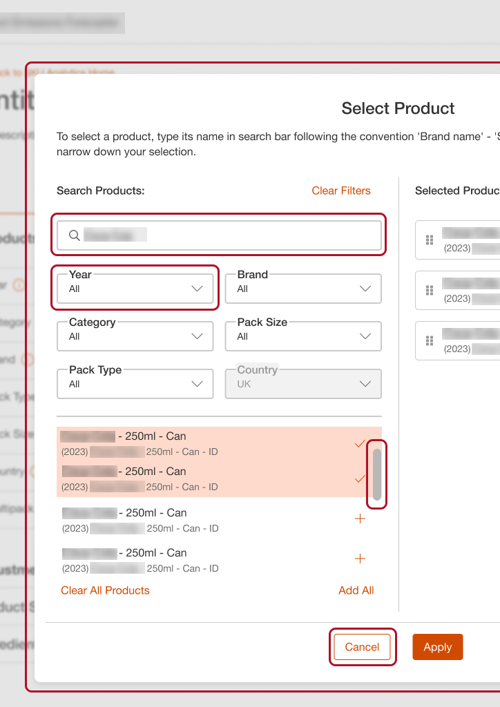
Modal: Frequently used in applications, this modal
component is scalable and has multiple header layout options,
allowing for flexible information presentation.
Text Box: With various configurations, the text box
includes options for icons on either side, embedded buttons, and
labels that can appear inside or outside the border. It supports
required and optional fields to meet diverse form needs.
Dropdowns: Styled consistently with text boxes, the
dropdown component functions fully in prototype mode, enabling
dropdown lists. It supports icon display and label positioning,
mirroring the flexibility of text boxes.
Scroll Bar: A unique request by the design team, the
scroll bar component offers a consistent style for applications,
easily dragged into designs for efficiency.
Buttons, Tooltips, and Tables
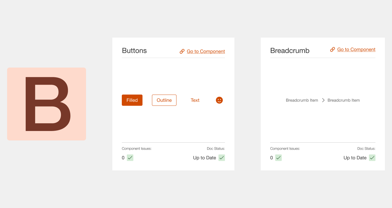
Buttons: Timber’s button component is highly versatile.
The example shown here is the Link Button, featuring basic text
with an optional icon. The component also includes multiple
button states, such as Filled (Primary), Outline (Secondary),
Link (Tertiary), and Icon buttons. These adaptable button styles
streamline interface consistency.
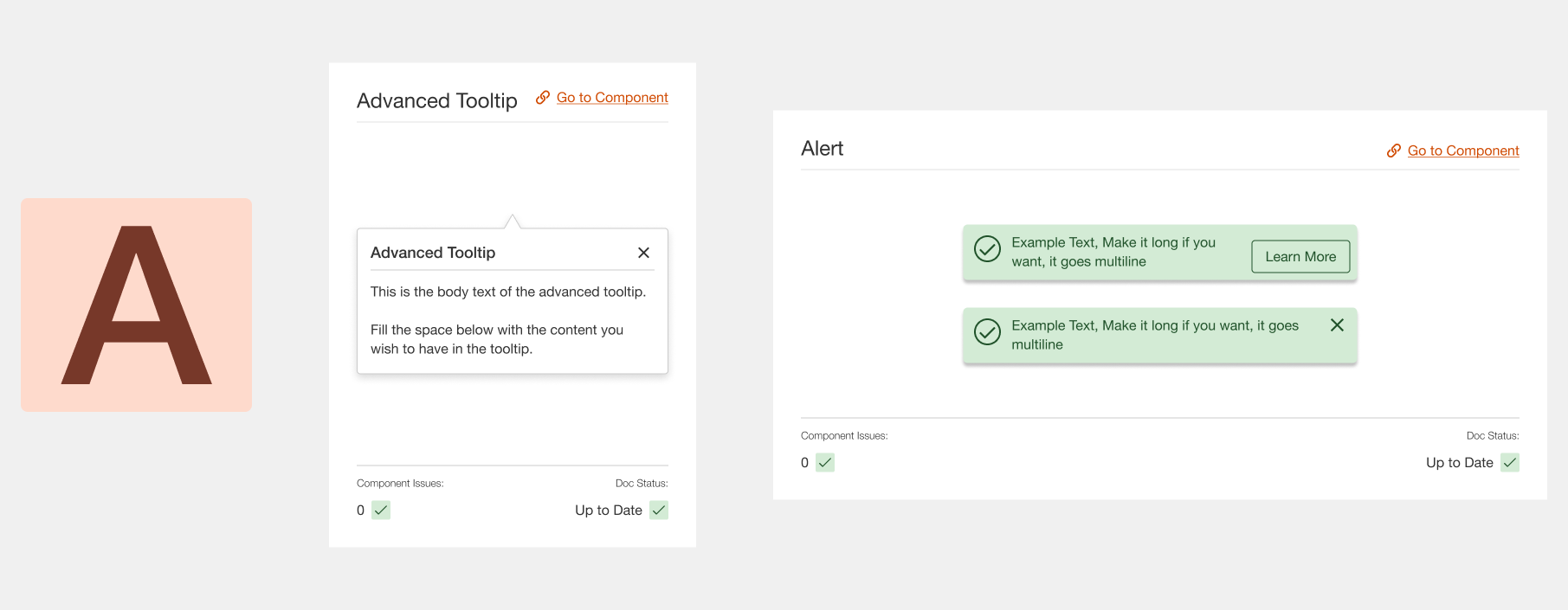
Tooltip: This tooltip component can be attached to any
element, offering different directional states for arrows.
Designers can choose top, bottom, left, or right placements
using a dropdown.
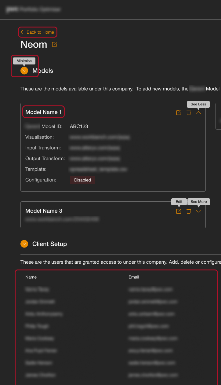
Tables: Our table component simplifies complex table
designs, including features like filterable and sortable
columns, and expandable accordions within rows, providing
efficient data handling in various application contexts.
Users can also collapse sections they don't use and their
choices will persist in the future.


Calendar and Lists
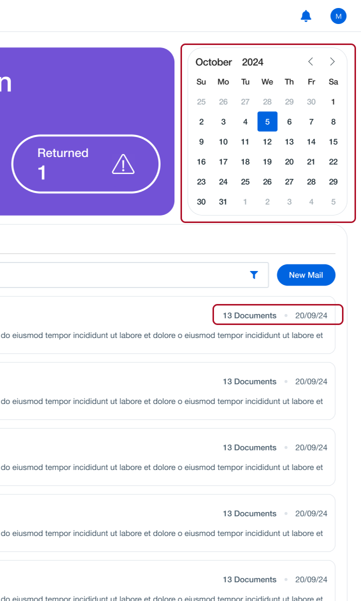
Calendar: This calendar component functions as expected,
enabling seamless date selection and scheduling.
Lists: The list component allows for customisable labels,
separated by diamonds or bullet points, offering a more polished
list format known as “fancy lists.”
Breadcrumbs and Stats
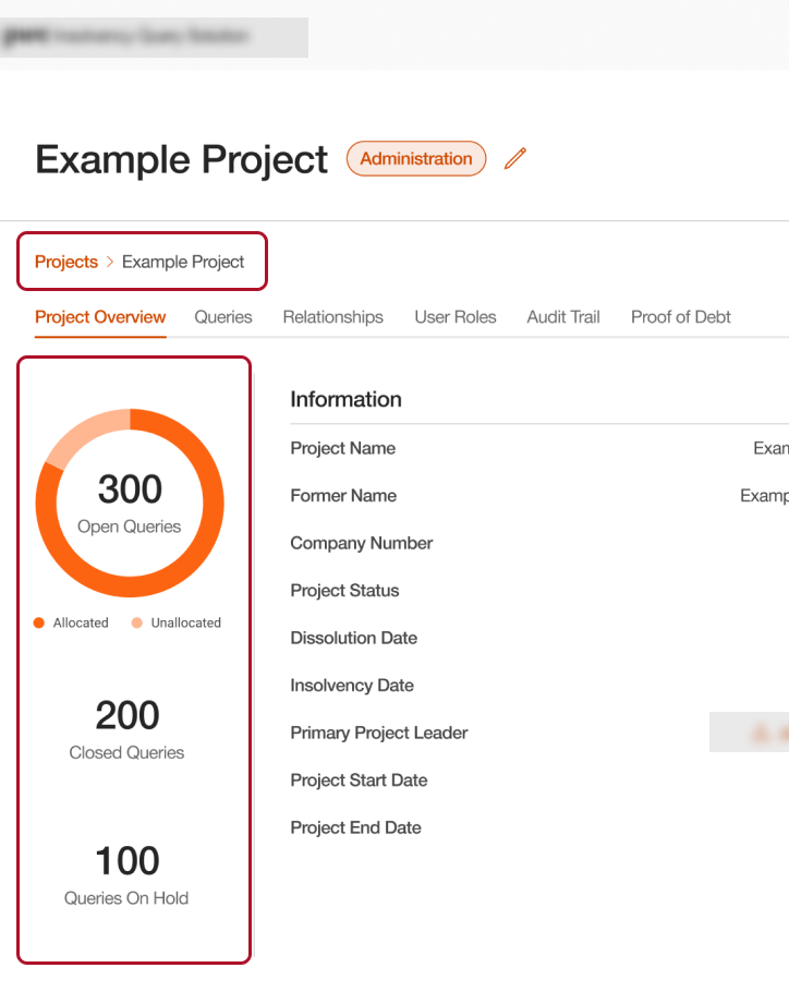
Breadcrumbs: This standard navigation element includes
optional icons, aligning with PwC’s design requirements and
providing clear navigation cues.
Stats: Tailored for data-heavy applications, our stat
components offer quick overviews of key metrics, helping users
interpret important information at a glance.


Upload Area and Icon Buttons
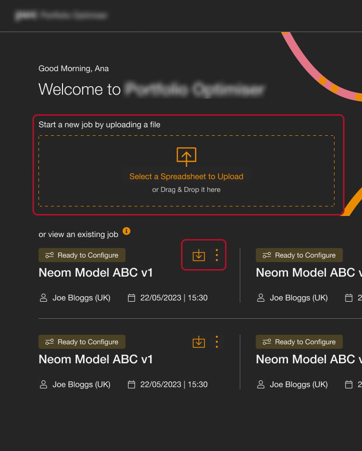
Upload Area: Recognising a common need, we developed a
reusable upload component, saving designers and developers time
by standardising the upload experience.
Icon Button: This example shows the Icon Button state
with active tooltips on hover, making the buttons clickable and
informative.
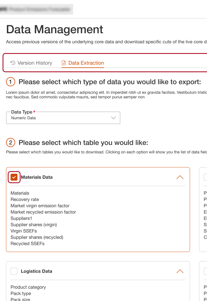
Tabs and Checkboxes
Tabs: Essential in data-heavy applications, the tab
component allows designers to indicate active states with
highlighted colours and optional icons, creating a visually
clear navigation experience.
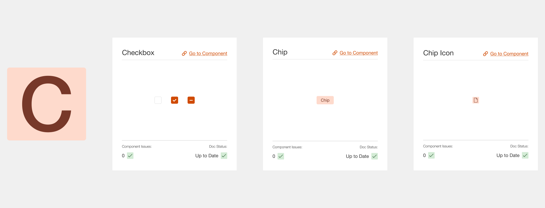
Checkboxes: A classic component, Timber’s checkboxes are
straightforward yet essential for user input in forms.


Primary Buttons, Toggles, and Table Accordions
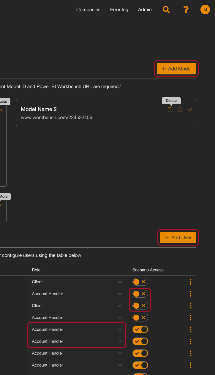
Primary Buttons: An example of the Primary Button style,
shown here with the icon option enabled, allowing designers to
choose from PwC’s icon library or Font Awesome icons for added
clarity.
Toggle: Replacing standard checkboxes, the toggle
component offers a sleek on/off visual with ticks and crosses,
making settings adjustments clearer and more engaging.
Table Accordions: This showcases the table accordion
functionality within rows, providing a compact way to display
expandable information.
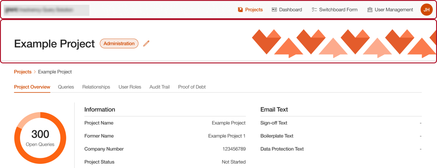
Navigation Bar and Page Header
Navigation Bar: Built to PwC’s brand standards, this nav
bar component offers options for logos, links, dropdowns, and
mobile variants, ensuring cohesive navigation across
applications.
Page Header:While page headers may be considered
traditional, they are a design standard at PwC. This component
offers a flexible way to add images and text, bringing structure
and identity to data-driven applications.


Alerts & Toasts
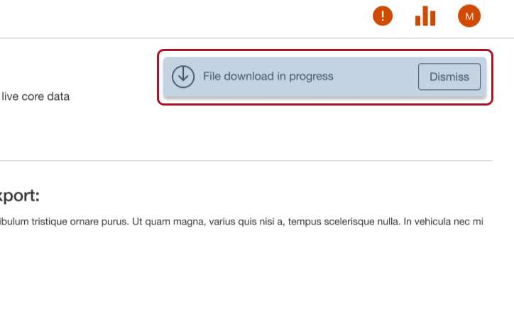
Alerts & Toasts: Our alert component library includes
various colours and configurations (with icons, buttons, or
plain) to suit informational, warning, or success messages,
making important updates visually distinct.
